
민프
[React] Styled Components - 2 프로젝트 셋업, Styled Components 적용 전 / 후 비교 본문
먼저
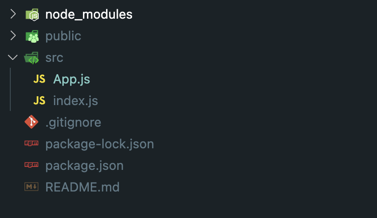
ㅇ. create-react-app (CRA)로 프로젝트를 만들고
ㅇ. src에 index.js, App.js만 남아있도록 한다.
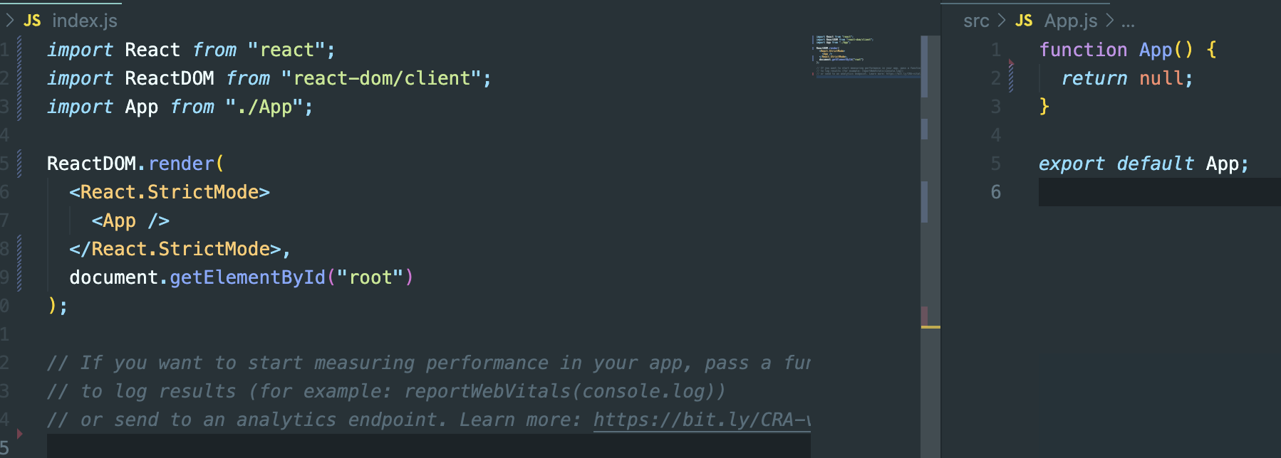
ㅇ. App.js, index.js 내용을 수정한다. 여기서 App.js는 아무것도 반환하고 있지 말아야한다.
ㅇ. 터미널에 npm i Styled-components를 입력하고
ㅇ. styled-components의 자동완성을 사용하려면 vscode-styled-components 익스텐션을 설치해줘야한다.
ㅇ. 마지막으로 npm start로 실행되는지 확인
자 이제 Styled Components의 적용 전 / 후를 알아보자
- Styled Components 적용 전
function App() {
  return (
    <div style={{ display: "flex" }}>
      <div style={{ backgroundColor: "teal", width: 100, height: 100 }}></div>
      <div style={{ backgroundColor: "red", width: 100, height: 100 }}></div>
    </div>
  );
}

export default App;
이런식으로 하게 되면 javaScript스타일로 적어줘야하기 때문에 불편한 상황이 발생되게 된다.
div가 많아지게 되면 직접 스타일을 확인해줘야 하기 때문에 CSS를 살펴보지 않고도 각각의 컴포넌트가 맡은 일을 파악할 수 있다면 훨씬 좋을 것 이다.
styled-components 적용 후
그래서 이번에 Styled components를 이용하려고 한다.
코드를 살펴보자
import styled from "styled-components";

//styled-components를 사용할때에는 작은 따옴표, 큰따옴표가 아닌
//backtick을 사용해야한다.
const Father = styled.div`
  display: flex;
`;

const BoxOne = styled.div`
  background-color: teal;
  width: 100px;
  height: 100px;
`;
const BoxTwo = styled.div`
  background-color: teal;
  width: 100px;
  height: 100px;
`;

function App() {
  return (
    <Father>
      <BoxOne />
      <BoxTwo />
    </Father>
  );
}

export default App;
위의 코드를 보면 알 수 있듯 각 박스의 역할은 무엇인지 스타일은 어떻게 주었는지 한눈에 알기 쉽다.
styled태그의 구문 :
styled.[HTML 태그]'(backTick) CSS '(/backTick)
하지만 이와 같은 방식도 분명.. div들이 많아질 수 있는 상황에서는 뭔가 복잡해질 것 같기는 하지만 그래도 박스의 역할을 문자로 쉽게 알 수 있어서 편할 것 같기는 하다.
그럼 styled-components는 어떻게 클래스를 만들어주고 스타일을 적용시켜주는 것 일까?
개발자 도구를 켜서 확인해보자

이와 같이 Styled components가 class명을 자동으로 만들어 주고 있는 것을 확인할 수 있다.
그럼 HTML 태그를 바꿔서도 해보자
import styled from "styled-components";

//styled-components를 사용할때에는 작은 따옴표, 큰따옴표가 아닌
//backtick을 사용해야한다.
const Father = styled.div`
  display: flex;
`;

const BoxOne = styled.div`
  background-color: teal;
  width: 100px;
  height: 100px;
`;
const BoxTwo = styled.div`
  background-color: red;
  width: 100px;
  height: 100px;
`;

const Text = styled.span`
  color: white;
`;

function App() {
  return (
    <Father>
      <BoxOne>
        <Text>안녕</Text>
      </BoxOne>
      <BoxTwo />
    </Father>
  );
}

export default App;
근데 이렇게 복붙을 하게 되면 더러워지는건 매한가지 일 것 이다..
Box를 하나로 통합하고 styled-components 코드 안에서 조정할 수 있도록 할 것 이다.
그렇게 하기 위해서는 props를 이용해야한다.
import styled from "styled-components";

//styled-components를 사용할때에는 작은 따옴표, 큰따옴표가 아닌
//backtick을 사용해야한다.
const Father = styled.div`
  display: flex;
`;

const Box = styled.div`
  background-color: ${(props) => props.bgColor};
  width: 100px;
  height: 100px;
`;

const Circle = styled.div`
  background-color: ${(props) => props.bgColor};
  width: 100px;
  height: 100px;
  border-radius: 50px;
`;

function App() {
  return (
    <Father>
      <Box bgColor="teal" />
      <Circle bgColor="tomato" />
    </Father>
  );
}

export default App;
이렇게 props로 스타일을 조정해줄 수 있다.
근데 내가 원하는 것은 원을 만들어내는 border-radius만 필요한데 이렇게 코드를 짜게 되면 또.. 중복되는 것들이 있다.
바로 width, height, bg이다.
Box 컴포넌트에다가 circle의 border-radius만 추가해보자
import styled from "styled-components";

//styled-components를 사용할때에는 작은 따옴표, 큰따옴표가 아닌
//backtick을 사용해야한다.
const Father = styled.div`
  display: flex;
`;

const Box = styled.div`
  background-color: ${(props) => props.bgColor};
  width: 100px;
  height: 100px;
`;

const Circle = styled(Box)`
  border-radius: 50px;
`;

function App() {
  return (
    <Father>
      <Box bgColor="teal" />
      <Circle bgColor="tomato" />
    </Father>
  );
}

export default App;
이렇게 스타일에 Box컴포넌트를 넣으면 Circle은 Box의 모든 것을 받고 있다. 따라서 Circle에 bg를 넣어도 잘 동작한다.
그럼 다음 포스팅에서는 다수의 컴포넌트를 다룰 때 도움이 될만한 몇 가지를 더 알아보자
'[React]' 카테고리의 다른 글
| [React] Style Components - 5 다크모드, 라이트모드 (Themes) (0) | 2023.01.23 |
|---|---|
| [React] Styled Component - 4 animation(keyframes), styled 컴포넌트 안의 다른 element 선택 적용 (0) | 2023.01.23 |
| [React] Styled Component - 3 다수의 컴포넌트를 다뤄보자 (attr) (0) | 2023.01.23 |
| [React] Styled Components - 1 (0) | 2023.01.23 |
| [React] 카카오지도(KakaoMap) API 적용하기 (0) | 2023.01.18 |


